Join for FREE | Take the Tour Lost Password?
Shop deviantART for the
holidays and save BIG!
Click here! :holly:
[x]

deviantART

 
©2008-2009 =francis001
:iconfrancis001:

Artist's Comments

Hey out there

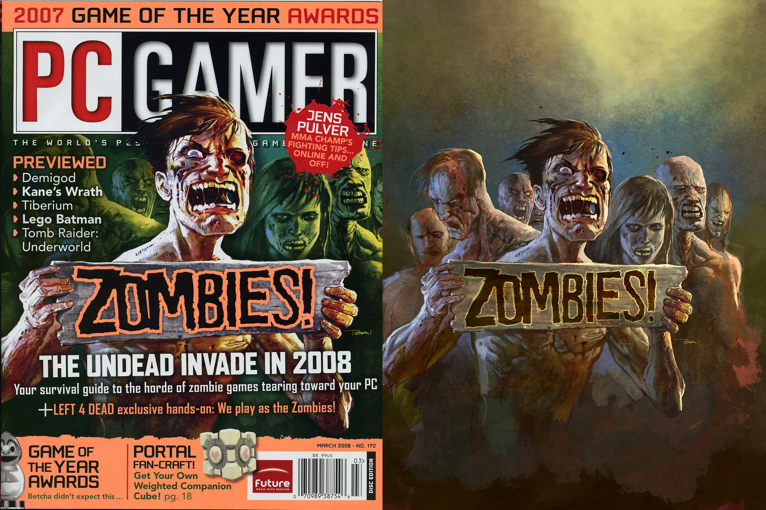
I was recently commissioned to provide a cover for PCGamer magazine, for a feature on zombie-related video games. Here's a scan of the cover, along with the artwork as I delivered it. Zombies are ALWAYS fun to draw and paint!

By the way, in case you're paying attention - I have not been able to add images to my site (teamgt.com) lately. Something broke with my installation of the open source "gallery" software I use. I'm debating between trying to fix it or revamping the site entirely. Whenever I get some free time....

Comments


love 1 1 joy 2 2 wow 0 0 mad 0 0 sad 0 0 fear 0 0 neutral 0 0
:iconstigmartyr762:
Awesome work on the cover, Congratulations!
:icondopepope:
Wow, looks great. The lose so much when they use it on the cover tho, not that you'd want it anywhere else. Congrats!

--
DOPEPOPE:experimental aesthetics
Bioengineered to be the Best:
.................................. [link]
The MetalMan Project:
.................................. [link]
:icondmitry1990:
duuude that is sick i was just reading that issue

--
Do u know what is the name of this mineral? (Mg,Fe)7Si8O22(OH)2?
Do you really wanna know?
Im not gonna tell.
Just google it.
:iconscruffyronin:
Awesome, I love zombies!

The zombie on the far right looks like he's having a rockin' time being the undead but the second guy from the left is pissed, maybe because he knew he's gonna be covered by a block of text or was he pondering the dilemma of being a zombie with no teeth?

--
Commissions • • Sketch Blog • • Tutorials
:iconguaschetti:
damn graphic designers! (im one of them)

--
[my english sucks, im a latin lover, sorry]

blog! [link]
:iconbonecrusherpati:
right side is amazing.
left side is classic "pop-up the front one" design.
:iconjohnpowell:
Looking good, zombies! Chomp chomp nom nom nom...

Or good looking zombies? Either way fun piece!

Those are some harsh color adjustments they threw down on the final cover though...
:iconvaliantonov:
The color in the magazine drops quite a lot. The original version is much better. Not to mention the lay outs and the color adjustment.. :)

--
A musician must make music, an artist must paint, a poet must write, if he is to be ultimately at peace with himself. - Abraham Maslow -
:iconwadefurlong:
Dude, your original looks amazing. The cover version though, beyond killed it. You painting is solid and sound. Props on your part, your rendered image..., but yeah the cover looks bad.

--
BLOOP~:fart:

:fuzzydemon:-+wAdE+-:fuzzydemon:
The Gypsy Queen Extraordinaire
:noir::noir::noir::noir::noir::noir::noir:
:iconduss005:
SOO freaking badass my friend

Details

February 25, 2008
630 KB
630 KB
1500×1000

Statistics

102
137 [who?]
4,719 (0 today)
0 (0 today)

Share

Link
Embed
Thumb

Site Map